

Very Peri: the new Pantone 2022 colour
Very Peri: the new Pantone 2022 colour. This suits a wide range of materials, textures and finishes. Moreover, it can provide a touch of warmth to any space in the home when introduced through furniture, home decorations and even through a painted wall and recurring patterns.
Very Peri: the new Pantone 2022 colour
Very Peri, Colour of the Year, represents a bold note that oscillates between hi-tech and realism. In fact, it is a colour that interprets the signals that come from observing what is happening in the outside world and gives a projection of it in terms of market trends not only in the world of fashion, but also in interior design.

Very Peri: the new Pantone 2022 colour – shutterstockphoto by Dasha Petrenko
The Pantone Colour of the Year
The Pantone Colour of the Year, which recalls the trend nuances year after year, was born in the year 2000, when the US company Pantone Inc. decided to elect the ‘Colour of the Year’ as colour inspiration for the world of fashion, design and creativity in general.
The Very Peri: Pantone’s new Colour of the Year 2022
The Very Peri is the new Pantone Colour 2022 has just been elected Colour of the Year by the Pantone Color Institute. It blends “the fidelity and constancy of blue with the energy and excitement of red“. It is basically a shade of blue tending towards violet that, thanks to a hint of red, gives a touch of liveliness in spaces where one wants to dare with creativity.
This is the new colour that will contaminate various sectors throughout 2022, including fashion, graphic design, industrial design and especially interior design.
An unusual shade between hi-tech and realism
Very Peri the Pantone Colour of the Year 2022 reflects the current period of transition we are experiencing. It represents the constant changes that alter lifestyles and mark a fine line between real life and digital reality. It belongs to the blue family, but looked at from a different perspective. In fact, it embraces its qualities, but at the same time possesses a violet-red undertone.
It is a colour of novelty and exploration, with which infinite colour combinations can be created. Therefore, depending on the combination with other colours, different atmospheres can be achieved. Very Peri appears more vibrant in combination with various shades:
- green
- yellow
- light blue
while it is more balanced when combined with shades such as:
- pink and terracotta.
Instead, it creates a sophisticated effect when paired with neutral colours such as greys, sand and taupe.
Furnishing with Very Peri
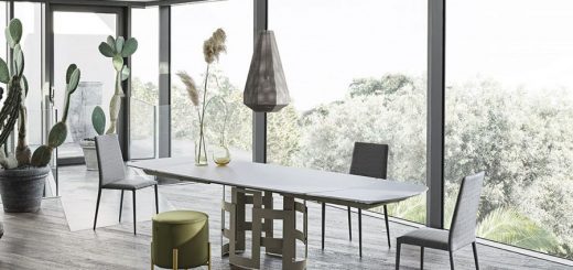
The new Pantone colour, symbol of new modernity, is also a new shade in interior decoration. Thanks to this colour, one can dare to create interiors and new lifestyles through sophisticated and unusual colour combinations. In fact, it can be applied to a wide range of materials, textures and finishes.
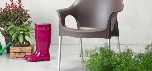
It is from this freedom of design that its main characteristic derives. Its versatility makes it perfect, in fact, it can be applied on the wall or inserted into a lively colour scheme by combining it with pink or coral. Unlike classic cold blues, Very Peri, with a hint of red, can also warm up rooms when used between furniture, for example on beds, sofas and armchairs. And again on the patterns of a natural fibre carpet and on accessories and furnishings, in a fully futuristic style.
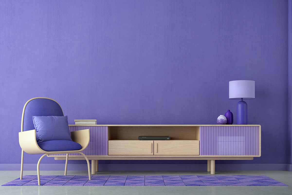
Very Peri: the new Pantone 2022 colour- shutterstock photo by Ninoon