

Colour palettes for the home: 10 refined and elegant combinations
- Choosing the right colour combinations to renew the look of your home
- The perception of colour and the feelings it evokes
- The importance of the right colour palette
- How to create the colour palette
- 1 The neutral colour palette: beige, brown and grey
- 2 Combining powder pink with lime yellow for a modern, homogeneous ambience
- 3 The nuances to match with terracotta colour
- 4 Pastel colours to be used in the living room
- 5 The palette for monochrome rooms
- 6 Matching complementary colours
- 7 Combining natural colours for a refined, Nordic look
- 8 Colour palette: matching dark colours
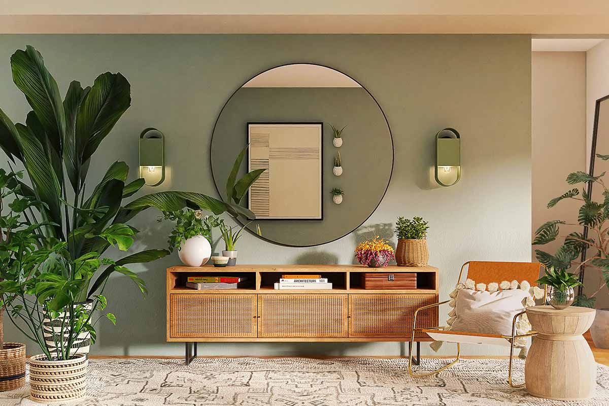
- 9 Jungle Effect Colour Matching
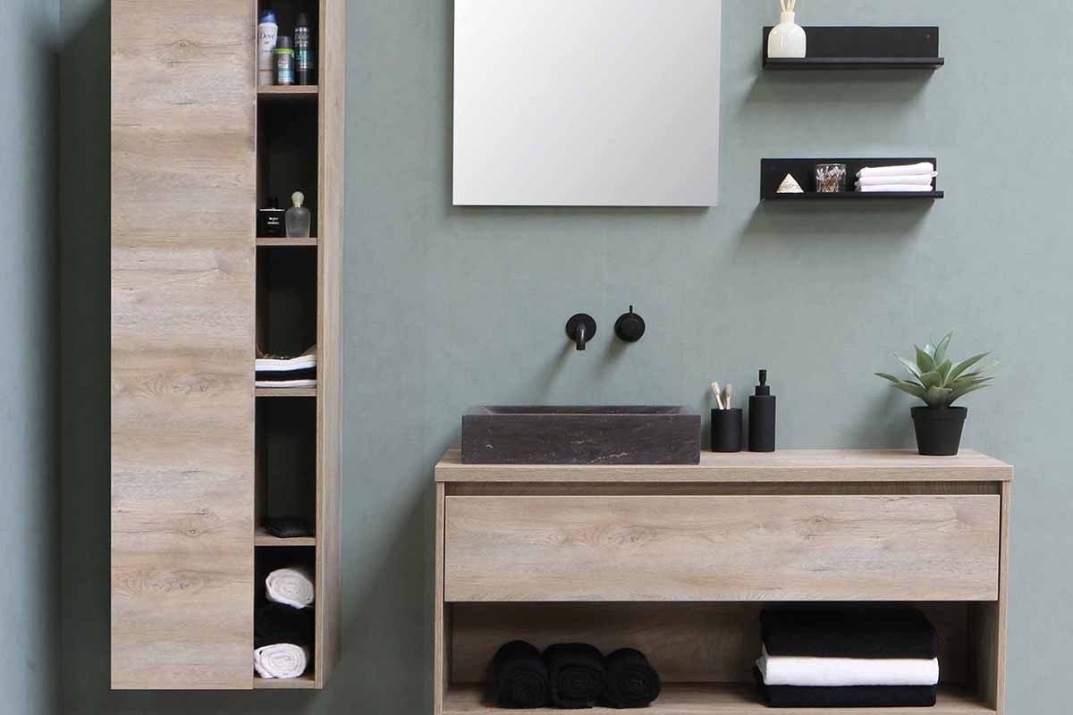
- 10 Colour Palettes for a Contemporary Bathroom
Choosing the right colour combinations to renew the look of your home
Defining colour palettes for the home is of paramount importance! Especially if the ultimate goal is to renew the look of the room and give it a modern, designer look. Not only that, colours also play a primary role related to the feelings they are able to evoke.
The perception of colour and the feelings it evokes
Colours with their different hues and shades evoke certain feelings, which affect, for example, the mood of the room occupant, energy and the ability to concentrate. Therefore, a first difference to be made is that between warm and cold colours. The former, such as reds, oranges, and yellows, are able to give warmth to the environment and give it a cosy feel. While, the second, cold ones, such as blue in all its shades, grey and purple are associated with water and sky and give a cool feeling.
Colour palettes for the home: 10 refined and elegant combinations – spacejoy – unsplash
The importance of the right colour palette
The colour palette, as mentioned, is of paramount importance when furnishing a home, whether you simply want to renovate it or redesign it from scratch. In fact, it is the colours and the way they are combined that define the appearance of different rooms in the home. Furthermore, it is good to bear in mind that this does not only apply to the colour of walls, but also to that of furniture, furnishings, fabrics and upholstery. Therefore, during the development phase of the design idea, nothing must be left to chance and everything must be taken care of down to the last detail. It is therefore of utmost importance to have an idea of what the final result will be, in order to avoid useless mistakes.
How to create the colour palette
To create your colour palette, you should divide the colours you want to use into three categories:
- Primary, basic: a neutral colour or several similar shades of the same palette, but in any case warm, to be used for example for floor and wall coverings, curtains and fixtures.
- Intense: a colour in a brighter, more saturated shade, to be used on structural elements, such as a wall, and some furnishing accessories such as a bookcase or an armchair.
- Breaking: useful to break up the perspective monotony of the first two shades. This colour is ideal for use on decorative elements that are not too central. Better if neutral, from greys to dove grey, beige to cream, and not the same as the primary one, but also white or black.
Thus, the first colour of the palette is the one that is present in most spaces and also on the ceiling. This is a good basis for different palettes and matches almost any colour type.
1 The neutral colour palette: beige, brown and grey
The classic colour combination for creating sophisticated rooms is to combine neutral colours, which are generally greys, taupe and beige, but also dark navy blue and white and black with warm, cool colours.
Usually, warm colours, such as taupe, browns and beiges are chosen for the bedroom area, due to their inherent ability to promote sleep. While cool colours are mostly used to furnish large, minimalist rooms with large, bright windows.
2 Combining powder pink with lime yellow for a modern, homogeneous ambience
Among the different types of colours are powdery shades, which are especially popular in the Nordic style. These when combined with different shades and materials help to create an original, modern and homogeneous ambience. A combination that can give the room character is that between powder pink and lime yellow. The former is one of the feminine colours par excellence, but thanks to the acid touch of lime yellow it creates a refined, vitaminic and extremely contemporary ambience.
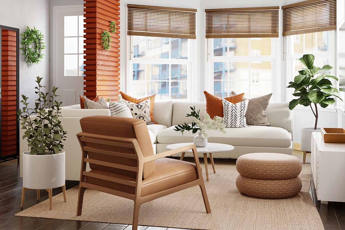
3 The nuances to match with terracotta colour
Knowing how to combine the colour terracotta, even in its most sought-after shades, such as terracotta pink, contributes to not making mistakes when designing refined and inimitable ambiences. Indeed, this is one of the warmest and most sought-after shades, which when combined with wood, metal or concrete elements helps to create and enhance the final material effect.
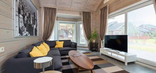
4 Pastel colours to be used in the living room
Those who wish to design a living room in soft shades can combine pastel colours, used as a furnishing base, with furniture and accessories in brighter, more colourful colours, such as lamps, cushions and small decorative objects. Bright yellow, for example, when used for dining chairs, even in combination with other saturated colours,2 can brighten up the space
Yellow is the perfect colour to brighten up the space, just be careful and use it for accessories. I don’t know if they will keep the dining chairs, but it would be nice to paint them in 4 different colours, following the proposed palette.
Colour palettes for the home: 10 refined and elegant combinations – spaceboy – unsplash
5 The palette for monochrome rooms
A timeless colour combination used in luxury and prestige interior design is the monochrome palette, which allows you to create a certain type of atmosphere. This is distinguished from the others in that it is characterised by the combination of different shades of the same colour, in all its gradations, from the lightest, which can create an airy atmosphere, to the darkest, which gathers the environment and makes it more intimate.
Monochromatic combinations are the simplest. Simply identify a dominant colour and match it with another with a darker or lighter tonal variation.
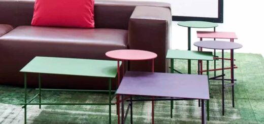
6 Matching complementary colours
Unlike monochrome combinations, matching complementary colours can be more difficult. But by juxtaposing:
- Yellow and purple
- Green and red
- Blue and orange
and placed next to each other, they vibrate and reinforce each other’s luminosity. This is also peculiar because when mixed equally they create the same kind of grey. Therefore, to combine them without making mistakes, it is good to dose the percentages and use 80% of the former and 20% of the latter.
7 Combining natural colours for a refined, Nordic look
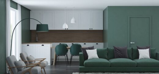
For a truly contemporary and chic décor characterised by natural elegance, you can combine the neutral colour of the floor and walls with an intense colour. This, from burgundy to acid green, lends itself very well to be used for the upholstery of armchairs and sofas. In fact, if used with the right balance it contributes to a harmonious and cosy ambience.
8 Colour palette: matching dark colours
Even when matching dark colours, it is best to follow the basic rules for creating a colour palette to avoid undesirable results. Therefore, use a basic colour, which can be, for example, dark grey. A deep, coppery colour to be used for table tops and kitchen worktops, for example. And finally, a break-out colour, chosen in its dark shade for the upholstery of chairs, armchairs and geometric decorations on the walls.
9 Jungle Effect Colour Matching
For a jungle result that is elegant at the same time, you can combine neutral colours, which characterise the colouring of the structural parts of the room, with intense, dark colours, such as brown or dark red, if it is the living area, for the colouring of the table or sofa. On the other hand, the ideal colour to break up the monotony of perspective, is green, to be incorporated into the environment thanks to plants, and perfect to use for certain details and details, such as the frames of paintings and mirrors
10 Colour Palettes for a Contemporary Bathroom
The perfect colour palette for furnishing a contemporary style bathroom is characterised by shades very similar to those that define minimalist environments. So, as a base, to avoid making mistakes and to give the room a sense of freshness, it is best to use white or a neutral colour on walls, ceiling and fixtures. This leaves ample decorating possibilities, and can be combined with wood colour, an intense colour, and beige and neutral wall coverings, breakaway colours.
Colour palettes for the home: 10 refined and elegant combinations – sanibell-bv – unsplash